


Who is this article for?Primary and Place Admins settting up their dashboard to monitor their Org at a glance
The dashboard enables you to see the most important KPIs in relation to your business compliance at a glance.
By default, your Dashboard contains:
- A heat map and a line graph of your Operations overall punctuality per Place per Week
- A heat map and a line graph of your Operations overall punctuality per Operation per Week
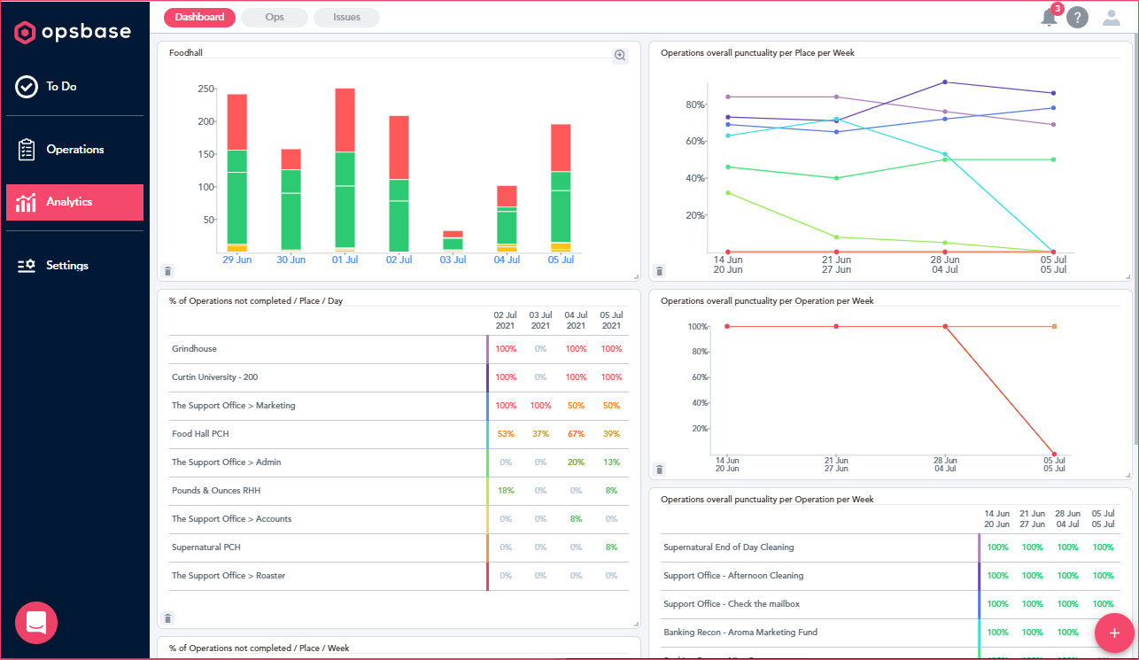
You also have the ability to add other reporting graphs from the Op/Issues Reports to your dashboard, such as:
- Site X's Op Completion Status
- Urgent Issues across all Teams
- etc.
1. Add Personalised Graphs
- Navigate to Analytics > Ops or Issues
- Generate a report of the information you wish to see by adding filters and groupings
- Make sure graphs are turned ON
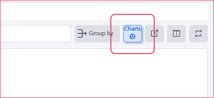
- Any graph that appears will have a Graph icon in the top left corner. If you toggle over, it shows Add to Dashboard. Click here!
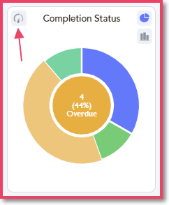
- Your new graph will now appear on your dashboard.
Once you have added a graph to the dashboard, you can do the following:
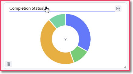
- Edit the Title - Click on the title of the graph to amend the name.
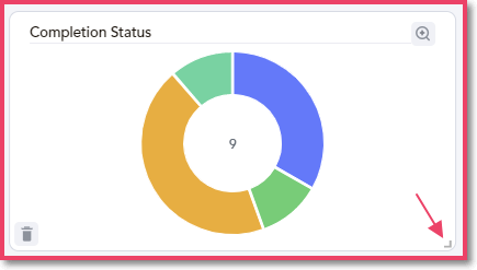
- Increase/Decrease the Size - Click in the bottom right corner and drag to make your graph larger or smaller.
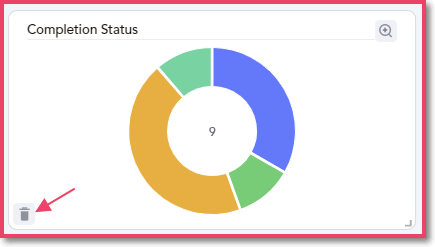
- Delete a Graph - Click the trash icon in the bottom left corner to remove a graph.
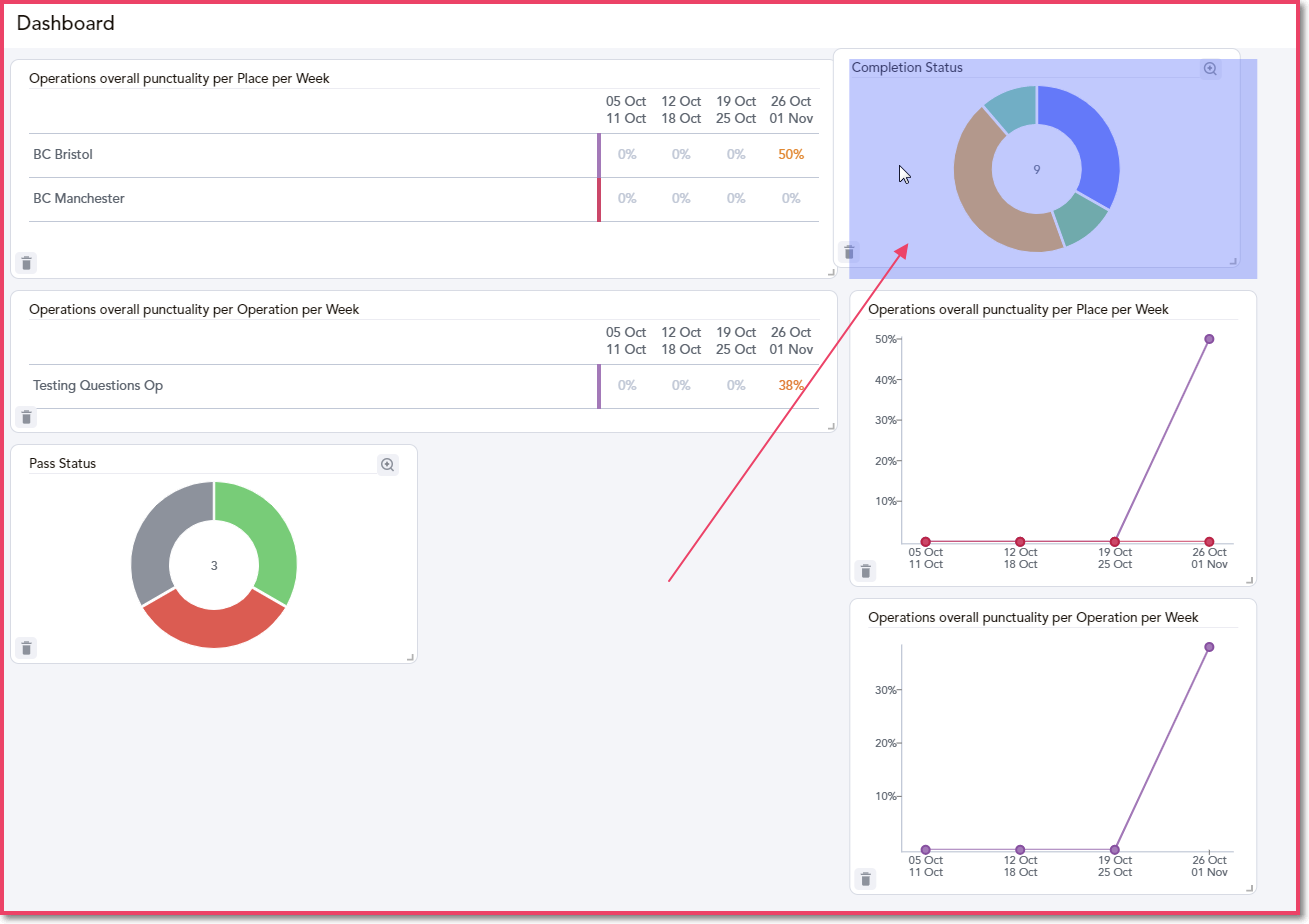
- Rearrange the Dashboard - Click on any graph and drag it around the screen to change its location on the page. As you move around, a blue box will appear to show you where it can be dropped.
2. How to Add Default Graphs
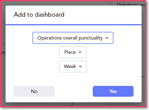
If necessary, you can re-add the default graphs by clicking on the pink + icon in the bottom right-hand corner on the Dashboard tab. You can customize what you would like the graph to show by choosing between:
- Ops overall punctuality
- % of Ops completed on time
- % of Ops completed late
- % of Ops not completed
The following information can be highlighted when adding a new graph:
- Comparing Places or Ops
- Broken down by day, week, month, year or quarter
Article Comments
0 comments